Home Point Financial had realized meteoric growth driven by a relentless customer focus. Their brand mantra—“We care”—is much more than a platitude. The company came to us to create a brand identity worthy of their purpose and achievements.
Home Point takes a strongly personal approach to mortgage servicing. The new identity had to reflect that truth by providing a framework within which people could play a strong role.
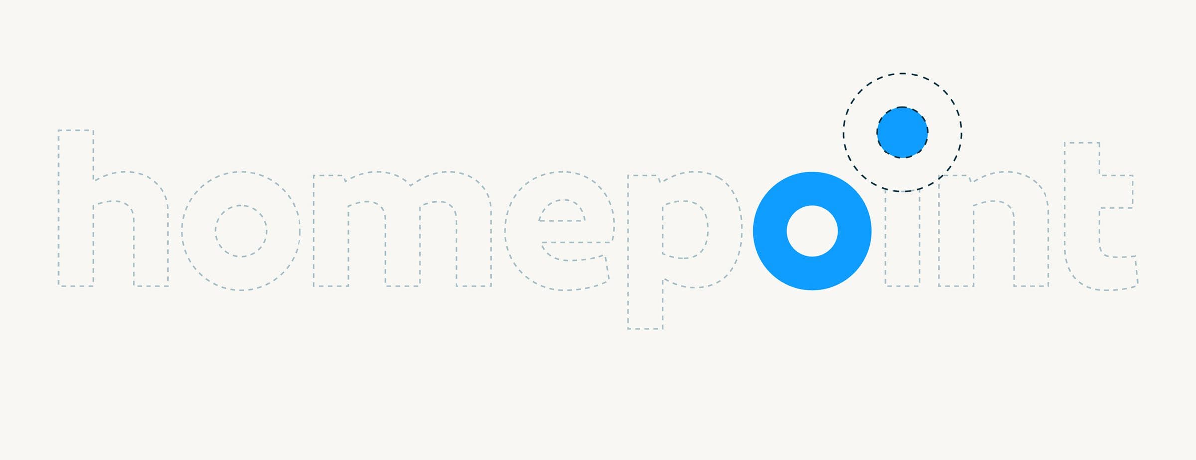
The concept of the new identity began with a proposition: what if we changed the name from “Home Point Financial” to simply “homepoint.” This allowed us to create a more elegant design system while also underscoring the company’s determined focus on the people it serves.

The relationship between the O’s and I in the homepoint logo mark created a subtle symmetry, while also forming the basis for a series of visual patterns.


A logo is important. But it’s just the capstone on a visual system that carries a message. We selected colors and created patterns that divert from the mortgage norm.


