Get 1000WATT’s weekly email
Smart industry takes and creative inspiration.
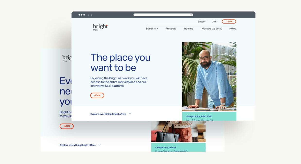
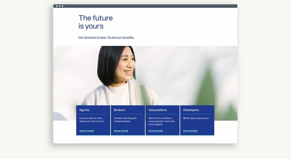
Redesigning a digital experience with a focus on usability and accessibility.
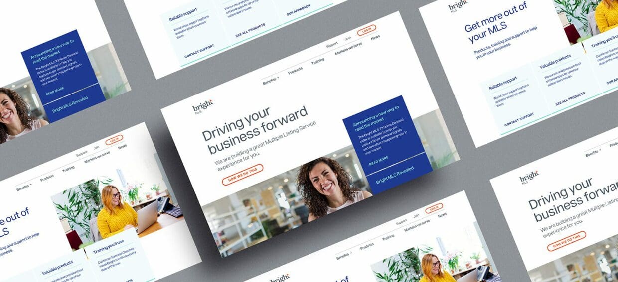
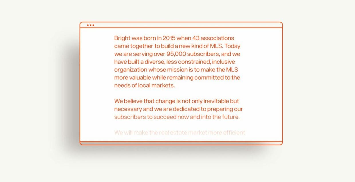
Bright is the nation’s second largest Multiple Listing Service, providing critical business support and a broad array of products to 90,000+ professional customers across the Mid-Atlantic region.
Bright was rapidly expanding and pioneering a new vision for what an MLS is and does, and therefore needed to completely reimagine the way it communicated and engaged online. With a laser focus on their customer, and a powerful commitment to accessibility, we sought out to redesign a large website from the ground up.
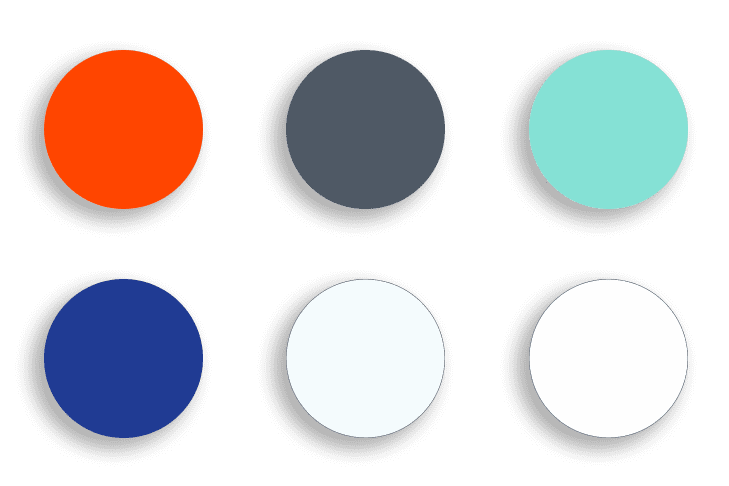
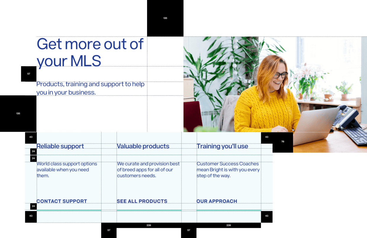
The content strategy was rooted in accessibility. Every choice we made was evaluated through this lens. This approach extended from the site’s information architecture to the user experience and impacted everything from the colors we developed to the typography system we employed.

Our effort resulted in a site that feels open, airy and — perhaps most importantly — alive. Design choices around scale, color and alignment added up to a truly usable experience. The relationship between alignment and word count was one of many myriad considerations we took into account.

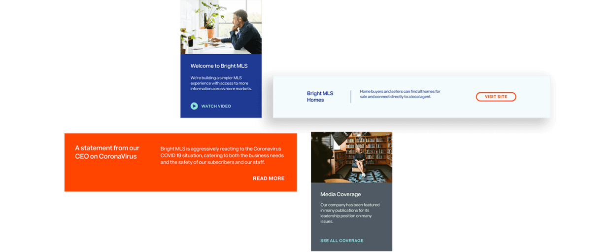
The content strategy demanded a branded approach to photography. We began by defining the parameters around what made an image a ‘Bright image.’ We translated the brand into keywords that would act as a filter for photography.
Our goal was creating a family of photographs that would elicit key emotions for the user.

We inclined towards imagery that felt alive: vivid colors, vibrant light sources, attitudes that glowed and an overall vibe that felt positive and uplifting.
We zeroed in on a typeface named Acronym to complement the imagery, a geometric sans-serif that perfectly balanced the personality we wanted to establish with our goal for highly-legible content.
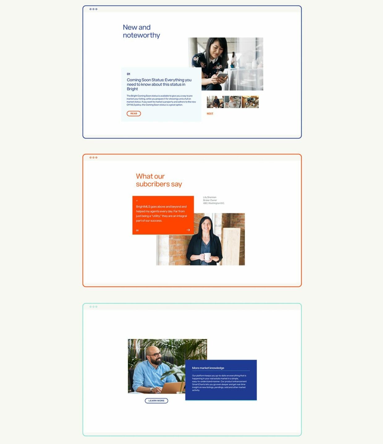
Key content moments were activated with context and personalization. We designed a dynamic set of alerts and messaging components empowering Bright’s marketing and communications teams with the ability to surface relevant resources, calls to action and timely notifications.
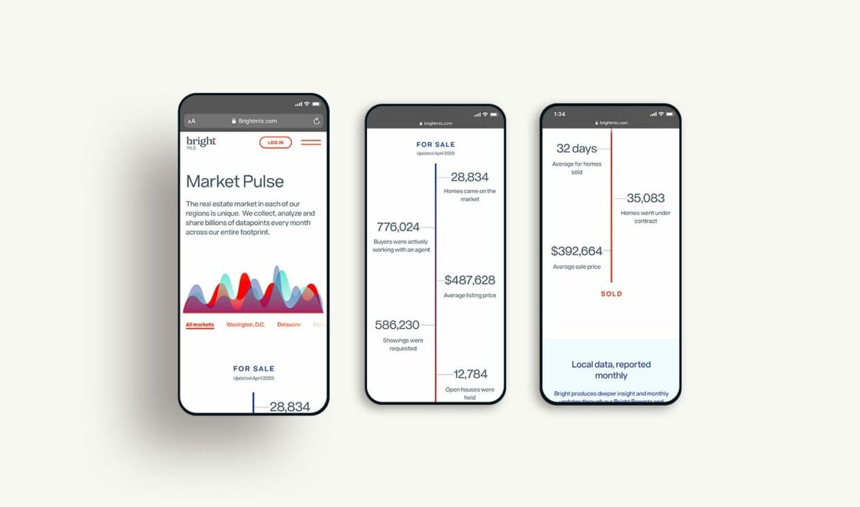
We extended the theme of personalization into a unique feature of the Bright MLS environment we call Market Pulse, a feature that would give users a real-time data narrative created around market activity in their area.
The base grid we designed around which we designed everything became an omnipresent yet invisible feature of the site. We employed a harmonic scale to every last detail of the website including text sizes, frame sizes, positioning, padding, scale, and hierarchy. This nuanced and intentional scale imbues the final impression with a sense of order that the user benefits from, but is unaware of.
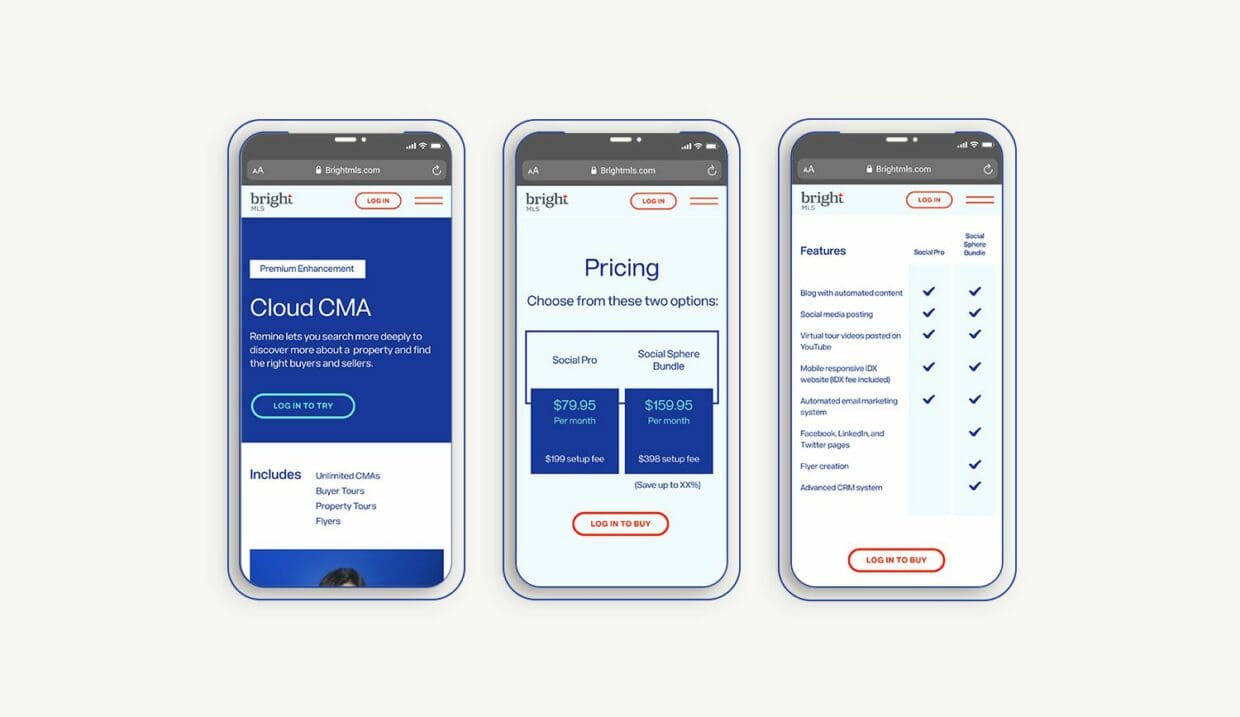
We approached the entire site through a responsive component design first, designing an ecosystem of independant parts that could scale both up and down in their complexity. This allowed the fundamental building blocks to accommodate a range of content needs which was a critical approach with a site this large.
Smart industry takes and creative inspiration.