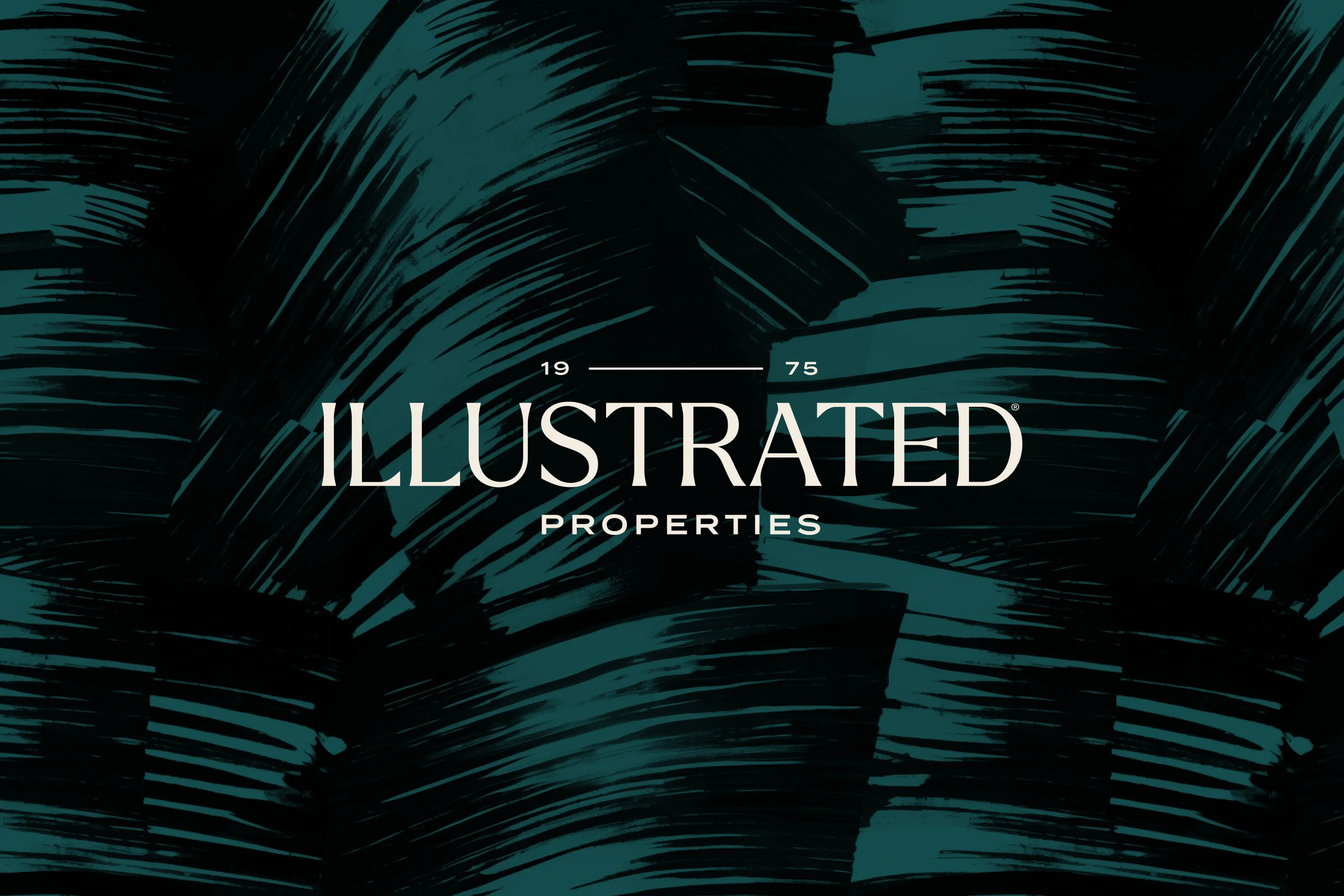
Illustrated Properties is a well known top-producing luxury brokerage in the Palm Beach, Fla., market. After nearly 50 years, the brand had found itself at an inflection point, wanting to re-energize and create consistency across touchpoints, and amplify its story to the marketplace. The time had come to reclaim the brand’s sophistication and present a more vibrant story to the world. 

We uncovered a tight-knit, storied brand with a stellar local reputation and a flare for authentic luxury. We helped the team articulate luxury in a way that felt true to their agents, their history, and their clients. 

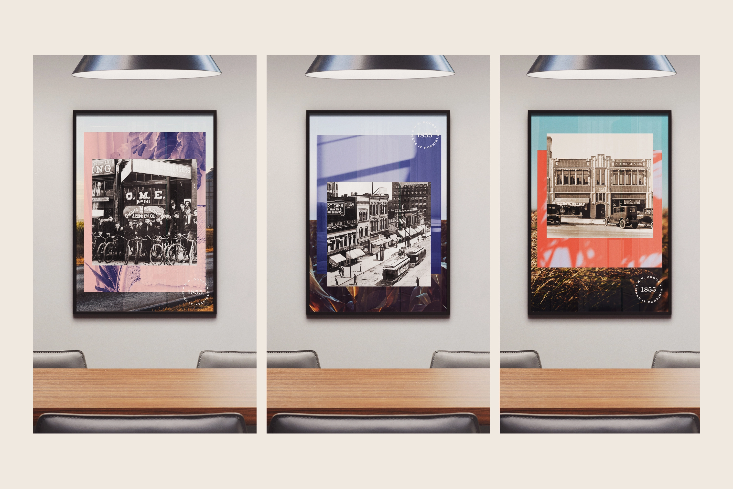
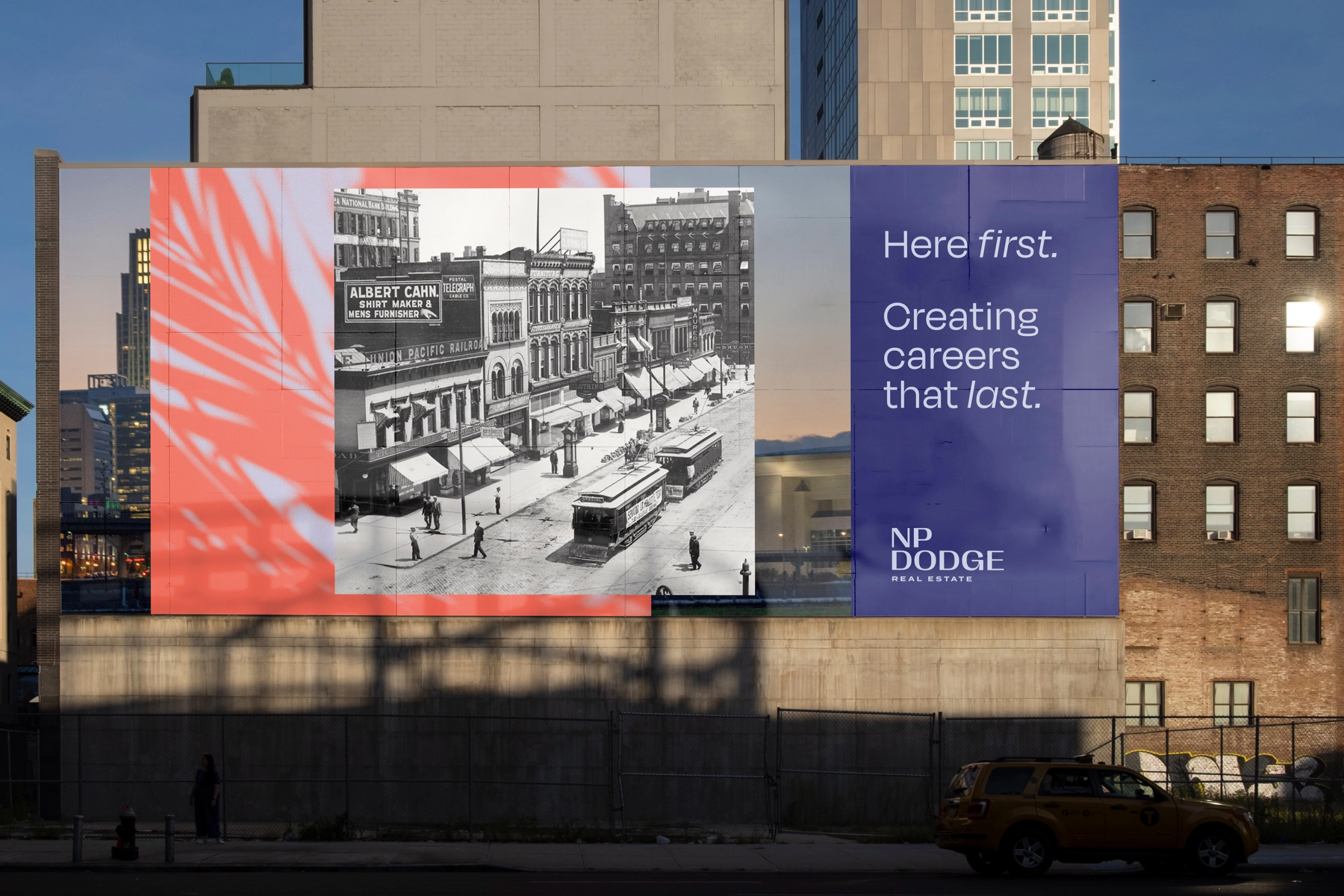
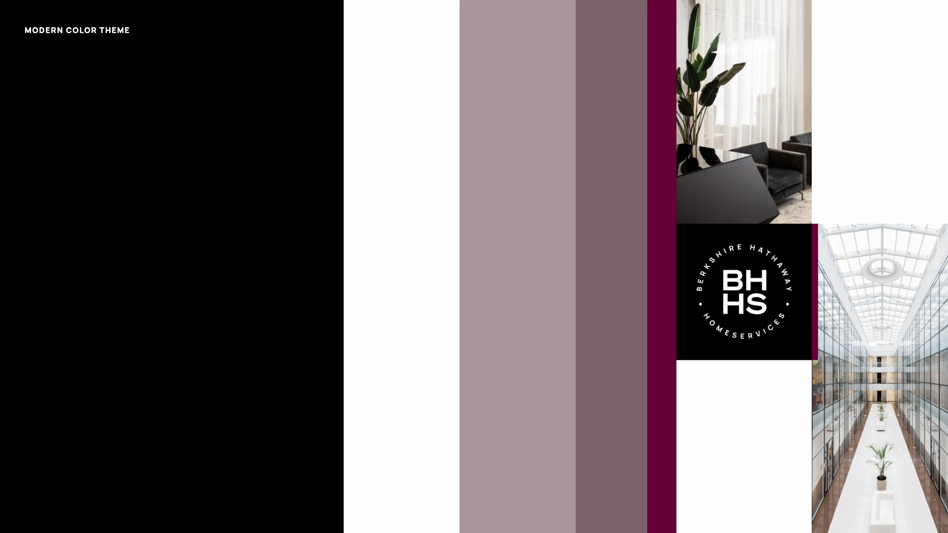
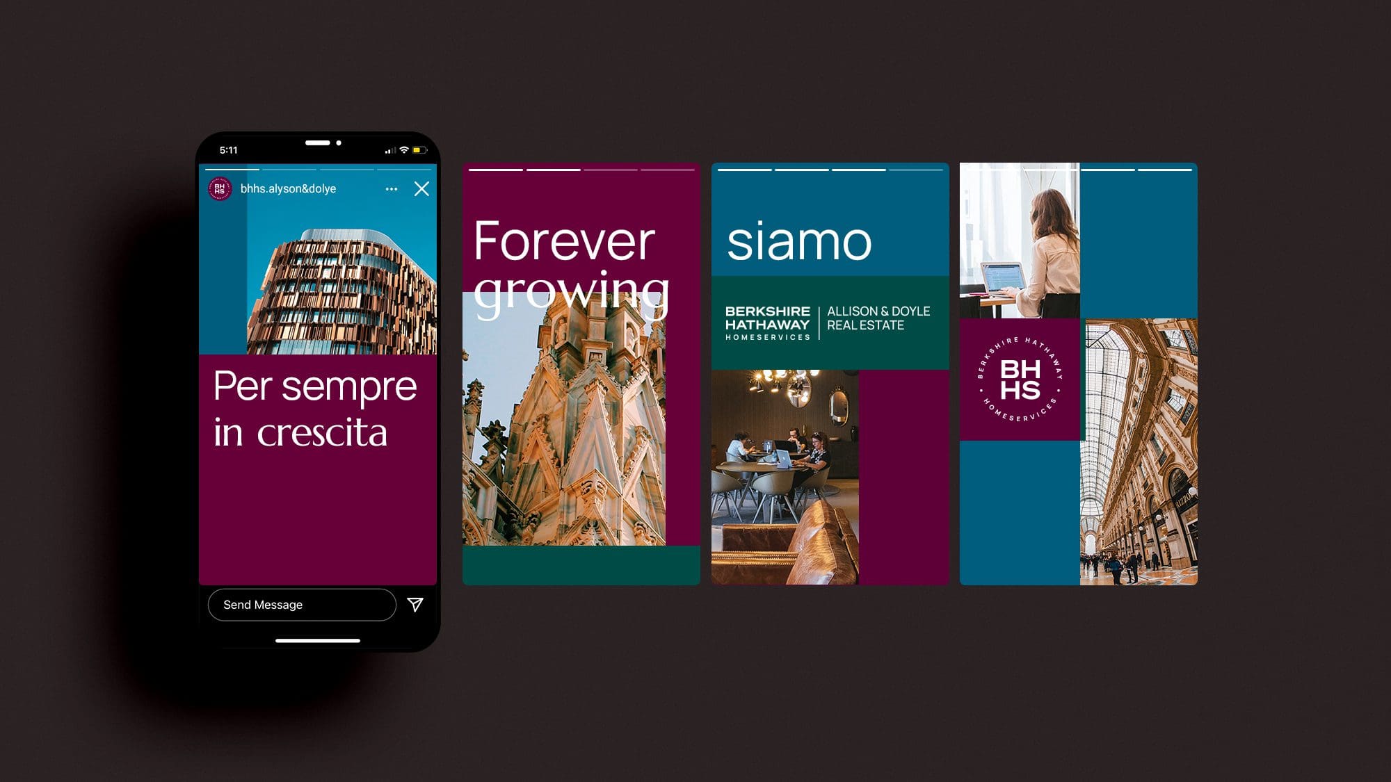
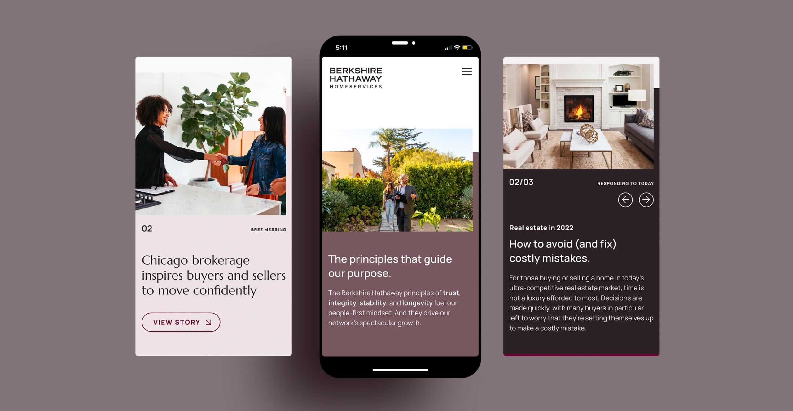
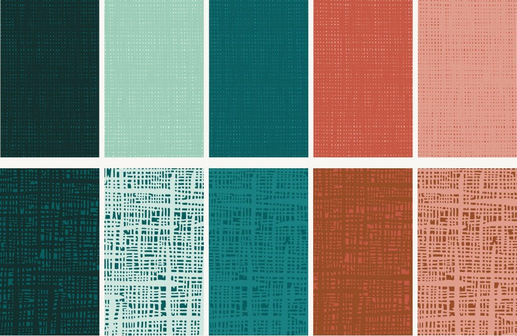
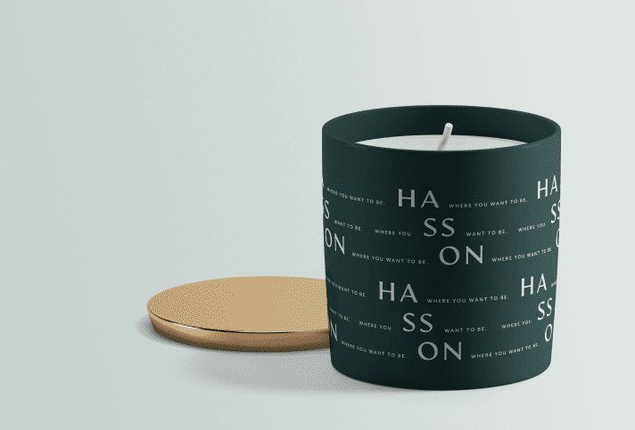
Our messaging work articulated a point of view centered around signature service and sophistication. And our visual work highlighted moments in a similar fashion, drawing from strength and local details, and pushing the company’s historical teal to new territory.

The result was an exciting moment for Illustrated Properties to boldly move ahead and lead in a changing luxury landscape.

“1000WATT was introduced to me at a time when our brand desperately needed something- we just didn’t know what. Our nearly 50-year-old brokerage had an incredible story to tell, but we didn’t have the mechanism to share it. Our brand identity had been so diluted that nothing we created looked or felt like us. The team at 1000WATT expertly interpreted a jumbled mix of stories and ideas into a roadmap that helped shape the beautiful brand identity we have today. Working with them was not only an absolute pleasure, but an incredible learning experience. We are grateful to have been introduced to such a dynamic firm & look forward to continuing to work with them well into the future. The combination of Illustrated Properties and 1000WATT was an absolute game changer.”

Liz Nunes
Chief Brand Officer, Illustrated Properties

“What would we create in this unique real estate moment if we had no restraints, no politics, no legacy baggage, and a few million dollars”?

The answer to this question was Avanti, a fictitious real estate company we “launched” at the the inaugural 1000WATT Brand & Marketing Summit.

In addition to building a business model with the help of some key industry advisors, we also developed the Avanti brand. That included a visual identity, high-level messaging, and a home page design + copy.

We started with brand attributes, which we translated into visuals, which in turn guided the design of the logo mark, color palette, and type choices. The Avanti brand’s “point of clarity” is choice. This was reflected in the logo mark itself, which uses a flexible typeface of our own creation. The visual identity and copy together communicate the brand strategy and position, and capture the spirit that inspired this effort.

The Avanti website’s home screen is a key touchpoint for manifesting the brand and communicating the functional and emotional benefits the company offers. Imagery, copy, and color work together.

Avanti is an app-driven experience. So we needed to show the app to explain what it does, while also communicating the high-level benefits is creates. And while this page needed to effectively communicate information, we also deliberately eschewed the typical “tech startup” look. This is real estate, after all.

Overall, we created a visual and copy hierarchy that moves from high-level brand language anchored in Avanti’s “choice” point of clarity, to key benefits and features, while effectively deploying the brand’s visual identity.

Established in 1855, NP Dodge is one of the oldest brokerage companies in the U.S. It’s a fourth generation family business whose founders helped break ground and establish Omaha, Nebraska, as a thriving community ready for families to lay down roots.

This storied brokerage came to us with a challenge we’ve heard before: They have a solid foundation of services and support for successful agents, a well-established presence throughout their region, and a culture of excellence where everyone knows you want an NP Dodge agent involved in your transaction. But, their experience and legacy comes with age. Newer, shinier brokerage companies were moving in and making waves. It was time for a refreshed image and a reinvigorated story.

Make it possible

Our goal was to retain NP Dodge’s substance and commitment to homeownership, building real estate careers, and contributing meaningfully to their region, while also giving the brand the energy that had been missing.

Since NP Dodge’s story was about making big things possible — homeownership, careers, local economic growth — we created the tagline, “Make it possible,” to lead our brand work forward.

A more flexible, dynamic logomark

Our goal was to breathe new life into the NP Dodge brand, making it more dynamic, energetic, and versatile. Flexibility emerged as a cornerstone of this redesign, responding directly to our client’s need for a system that would adapt seamlessly across various applications.

The existing logomark presented challenges—it felt bulky and limiting. We saw an opportunity to create a more refined and flexible design system that not only enhanced usability but also introduced a fresh, dynamic aesthetic.

A standalone monogram

At the heart of our solution is a new monogram — a square-shaped design integrating the letters “NP” with a subtle arch forming the capital “D.” This interwoven, monoline structure serves as both a standalone mark and a foundation for a rich visual system. By deconstructing the monogram, we created patterns and motifs that add depth and versatility to layouts, offering endless possibilities for brand expression. These elements interact harmoniously with photography, creating layers of visual interest and dimension.

Evolving Color

The color palette builds on NP Dodge’s original red and blue hues, evolving them into more vibrant, modern tones. Supplemented by rich, neutral secondary colors, the palette provides a wide range of options for both bold and subtle design expressions. These colors shine particularly well when paired with the graphic system, adding depth and texture to imagery and layouts.

Home Point Financial had realized meteoric growth driven by a relentless customer focus. Their brand mantra—“We care”—is much more than a platitude. The company came to us to create a brand identity worthy of their purpose and achievements.

Home Point takes a strongly personal approach to mortgage servicing. The new identity had to reflect that truth by providing a framework within which people could play a strong role.

The concept of the new identity began with a proposition: what if we changed the name from “Home Point Financial” to simply “homepoint.” This allowed us to create a more elegant design system while also underscoring the company’s determined focus on the people it serves.

The  relationship between the O’s and I in the homepoint logo mark created a subtle symmetry, while also forming the basis for a series of visual patterns.

A logo is important. But it’s just the capstone on a visual system that carries a message. We selected colors and created patterns that divert from the mortgage norm.

Could a brand claim ‘forever’ and mean something to people across the world?

Warren Buffett said, “Our favorite holding period is forever.” So when he launched his brand into real estate ten years ago, creating Berkshire Hathaway HomeServices, the company was bound to be associated with everlasting qualities. In just a decade, BHHS became a  revered international real estate brand.

The Berkshire Hathaway HomeServices team came to us with a big idea around being a “forever” brand — one that endures because it’s based on lasting ideals, business fundamentals, and people. We answered that forever could be a commitment to the future — to inclusivity, sustainability, and people working together. What if the brand could make good on the promise of forever through the actions and choices of today, both symbolic and operational? What if a “forever agent” meant a lifelong advisor and community builder, someone with serious impact on the world around them.

As an international brand, the BHHS team, lead by Senior Vice President of Marketing Wendy Durand, came to us with a list of complexities. The Berkshire Hathaway HomeServices brand identity has to work in both Minneapolis and Lisbon, for example, and for both luxury properties and entry-level homes in coastal, urban, suburban, rural areas and everything in between. It has to speak to agents and consumers. Its long name has to be able to stand alongside other potentially long names. And the brand has to mean something to people in each of these situations.

It starts with a big vision

To meet these challenges, we created a brand strategy articulating a vision that would lead the brand into the next decade and connect to the concept of forever. We defined in fresh terms the brand’s big vision, mission, purpose, promise, ethos and character, and the brand’s positioning in the world. We created a messaging strategy to push our new narrative forward.

For visual design, we engineered a brand identity system that would ease complexities and also allow room for slightly customized expressions for various regions.

Connecting the brand to its most important people

A major objective we had was to further define the concept of “forever agent” and tie it to the big idea underpinning the brand strategy. We leveraged a branding tool referred to as a Brand Muse to help make this happen.

A Brand Muse is an aspirational character with a narrative that a brand can use as inspiration for branding, marketing, and operational initiatives like culture building and new products and services. It is the “total human being” that a company wishes to attract, and becomes a motivating force in shaping new ideas.

Brand management for launch and beyond

With an organization of this size and geographic footprint, it became clear how important the brand guidelines would be in both at launch, and managing the brand in the world going forward across a global footprint. We spend a lot of time developing detailed guidelines for every design project we do, but for BHHS we added extra detail, laying out the instructions and uses for the adaptive color palettes, the “forever” concept copy, and the brand’s foundational story elements like Brand Ethos, Vision, Mission, Promise and Purpose.

Engineering a flexible, future-ready logo system

The best design considers both form and function, but sometimes one will lead, depending on business needs and circumstances. In this case, when we set out to work on the logo, we knew we needed to start with function as a design mandate. The sheer complexity and demands on the logo (a very long name, for example) made it clear that the logo needed to be easy to implement, flexible in application, and able to scale with growth.

We used the foundational shapes of the Berkshire Hathaway HomeServices letterforms in the wordmark as our root to build from. This kind of “visual math” allowed us to devise a systematic approach that would define both the scale and negative space in and around the affiliate names.

Color is a tricky topic for brands that have been in the world for years. For Berkshire Hathaway HomeServices, the color “cabernet” had become synonymous with the brand, and that equity was too much to abandon. Instead, we enhanced this color towards a space that felt more alive and vibrant, and surrounded it with varying pink and warm neutral tones that are unique in real estate.

To meet the need for the brand identity to adapt to different areas of the world without diluting consistency, we created an adaptive color palette. The system gives affiliates around the globe options for palettes, but maintains consistency through tightly defined sets. The in-house marketing team at Berkshire Hathaway HomeServices corporate worked closely with us to define and refine the end results that answered affiliates’ needs.

It was important to us to deliver a flexible and scalable approach to grid. We had established a narrative with the logo around the equilibrium that exists between corporate and affiliate, the mutual respect and interdependency of their relationship. So we reinforced that narrative with a grid system that mimicks it in a way with a half and half convention as a base for the grid.

“The deepening of the Berkshire Hathaway HomeServices brand was a thoughtful and strategic undertaking that needed to be executed with the utmost care and consideration. 1000WATT took us on a journey that beautifully re-envisioned our identity to live in the digital and traditional marketing space, incorporating an invigorated collection of colors and designs.”

Wendy Durand
Berkshire Hathaway HomeServices, SVP, Global Marketing and Communications

Latter & Blum was founded in 1916. The Merrick family bought the firm in 1986 and subsequently acquired other, smaller, brokerages across the state of Louisiana. It was time to unify these companies under one brand. Our task: create a visual identity and campaign that would preserve a brand beloved in New Orleans, but would also be embraced by agents and consumers across a proudly diverse state rooted in regional identity.

Always Building

Latter & Blum calls itself a “family of families.” Within the company, one feels the truth of that. There is a sense of constantly pushing forward, adding to what is, and creating new opportunities. This company builds. It builds communities, careers, lives.

The new company campaign and rallying cry, “Always building” captures that character.

An identity as rich as the place

Louisiana is rich in culture, diversity and regional pride. The new visual identity system had to reflect that. We drew from the regional flags we saw as we traversed the state; re-interpreted the fleur-de-lis we saw throughout New Orleans; developed a color palette at once vibrant and elegant. 

We formed these things into a system, capped by a new logo, that could carry the brand statewide for years to come.

“We approached 1000WATT with a complex branding situation coupled with major leadership change. They were the only group we trusted to handle this critical project at such a critical time for our company. 1000WATT’s deep understanding of the real estate industry and brokerage landscape was invaluable. At every step they exceeded expectations. We are friends and clients for life.”

Lacey Conway
CEO, Latter & Blum

Radian was already a well established force in mortgage insurance when it started homegenius, a company whose sights were on innovating for the entire real estate industry through a combination of data science, AI technology, services, and relationships that were decades deep. 

After a few years of building and growing homegenius products and services, it was time to unwind the tape on product branding and reorganize around a more unified primary brand family structure that would affect naming, logo system, color palette and brand story. It was time to articulate the larger vision driving everything: an ecosystem of real estate products and services that would bring every piece of the transaction together in ways no other company had dared nor was prepared to do.

Building a bigger brand strategy

It quickly became clear that homegenius was not just another tech vendor building products for real estate businesses. This team not only had a vision for a much larger ecosystem of products, services, data and people, but also had the industry experience and decades of relationships it would take to pull it off. For the first time ever, we saw firsthand a vision for transforming the industry for the better for everyone, from within, instead of the usual “disruption” from outside that so many tech folks had brought to real estate in the past.

We built a brand foundation that reflected this vision, positioning, and point of origin. Our big idea became one of transformation, connection and possibility, not disruption. And these themes drove a lot of the design work that followed.

The look of a bold vision

Brand identity work doesn’t always have to start with a new logo. In this case, we inherited the homegenius logo, but optimized it and refined it to reflect our new brand story and big idea of possibility. We brought in a celebrated typographer to redraw the wordmark from scratch to improve the fundamental shapes without losing the spirit of the original. Then we defined the dots over the ‘g’ and ‘i’ as connection points, reinforcing the idea that homegenius is a digital ecosystem where people connect.

We think the fine tuning and tailoring made all the difference in this case.

Architecting the entire family

Homegenius includes a vast roster of products and services. Part of our design charge was to develop a brand architecture system to organize the various products around a unifying “primary brand” structure. This family structure encompassed naming conventions, the logo system, and the color palette.

Color coding

A color system that worked beautifully together, but could also be deployed by audience segment to create distinction, was integral to the strategy behind the brand architecture.

Clouds

Multiple audiences join together in the homegenius ecosystem. So to visualize this, we introduced a series of color ‘clouds’ as a primary brand element. Each cloud picks up one dominant color from the brand palette. The clouds illustrate the myriad connections we foster made possible in a digital space.

Photo style

We employed a narrative, black-and-white photo style to tell a story. Somewhat dramatic and reminiscent of film photography, this style sparks interest, elicits emotion, and stands apart from competitors.

Website

Our work extended into the homegenius website itself with an extensive and comprehensive content strategy plan designed for user empathy. Because homegenius serves four separate audiences with this site, we reorganized the navigation experience to be persona-first, rather than product-first. We did this by developing a top nav ‘mega menu’ system for users to quickly find the products that solve for their particular needs.

The content strategy required us to design a comprehensive suite of dynamic components to account for both immediate needs, and future scenarios, for this rapidly growing enterprise.

Hasson Company was at a crossroads. With a legendary founder, a strong market position and top producing agents, they could continue doing what had always worked. Or, they could acknowledge an increasingly competitive landscape and fortify their brand for the future. They chose the latter.

A reflection of our place

After we established the brand strategy and story we got to work on a visual system worthy of the compelling company it represented. We anchored the visual approach in the idea that the brand should act as a mirror to the Pacific Northwest, reflecting the beautiful contrasts that exist here. From coastal landscapes and high desert vistas to suburban and urban environments, the brand needed to exist in and reflect a diverse geography.

We redesigned the logo to create a bold visual hierarchy that placed emphasis on the name Hasson; highlighting the legacy of Mike Hasson, the company’s founder, and how his values crafted the brand into what it is today. This hierarchy also makes the logo feel more dynamic and active.

We also crafted a brand glyph inspired by the ‘H’ letterform. This brand glyph acts as a vessel for the Hasson promise and vision, carrying with it the thoughtfulness and intention the company has for its brokers and employees.

The visual elements we developed for Hasson’s identity were inspired by the hues and textures of the natural environment in the Pacific Northwest. Each color in the palette is pulled from a geological feature or area in the region, culminating in an array of vibrant green tones that are activated by warmer, earthier colors.

The natural, woven textures found in the system add a more handcrafted touch to the brand.

As we began our design process we noticed that the Hasson name had a beautifully balanced symmetry. Bookended by the two, strong vertical lines that make up the “H” and “N,” the openness of the “A” and “O,” and the repetition of the double “S’s” this wordmark had everything we needed to create striking typographic patterns. These expressions, made from both the company name and the tagline further amplify the importance the founder has had on the company and culture.

Modern Poster Mockup Vol.7 by Anthony Boyd Graphics

We helped Hasson announce the rebrand to its agents in a way that would maximize impact and excitement. This included internal messaging and assets like a landing page highlighting the rebrand and story.

“I have never been part of a marketing or branding initiative that has been so well received. I am so confident this will carry us into well into the future. I am bursting with pride and gratitude for what you have created.”

Lynae Forbes
The Hasson Company, President