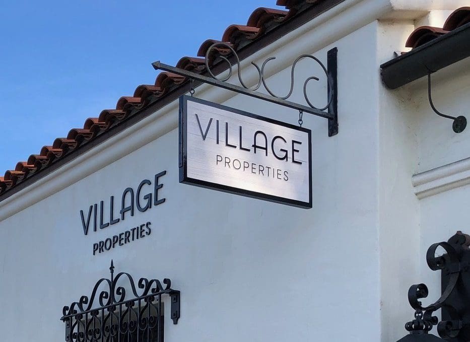
Village Properties is a leading brokerage in Santa Barbara, California, with a solid reputation, a passion for place, and a boundless dedication to going above and beyond. After 25 years, it was time to rethink the brand and enable it to reflect externally what was unique and special inside the company’s core.
We began by developing their brand’s positioning and messaging to express the company’s ties to place and the concept of “placemaking,” and highlight the core values that drive everything they do. We created brand language, identity and visuals evocative of magical places and our emotional connections to them, and we paired it with colorful, local images to tell a strong story.
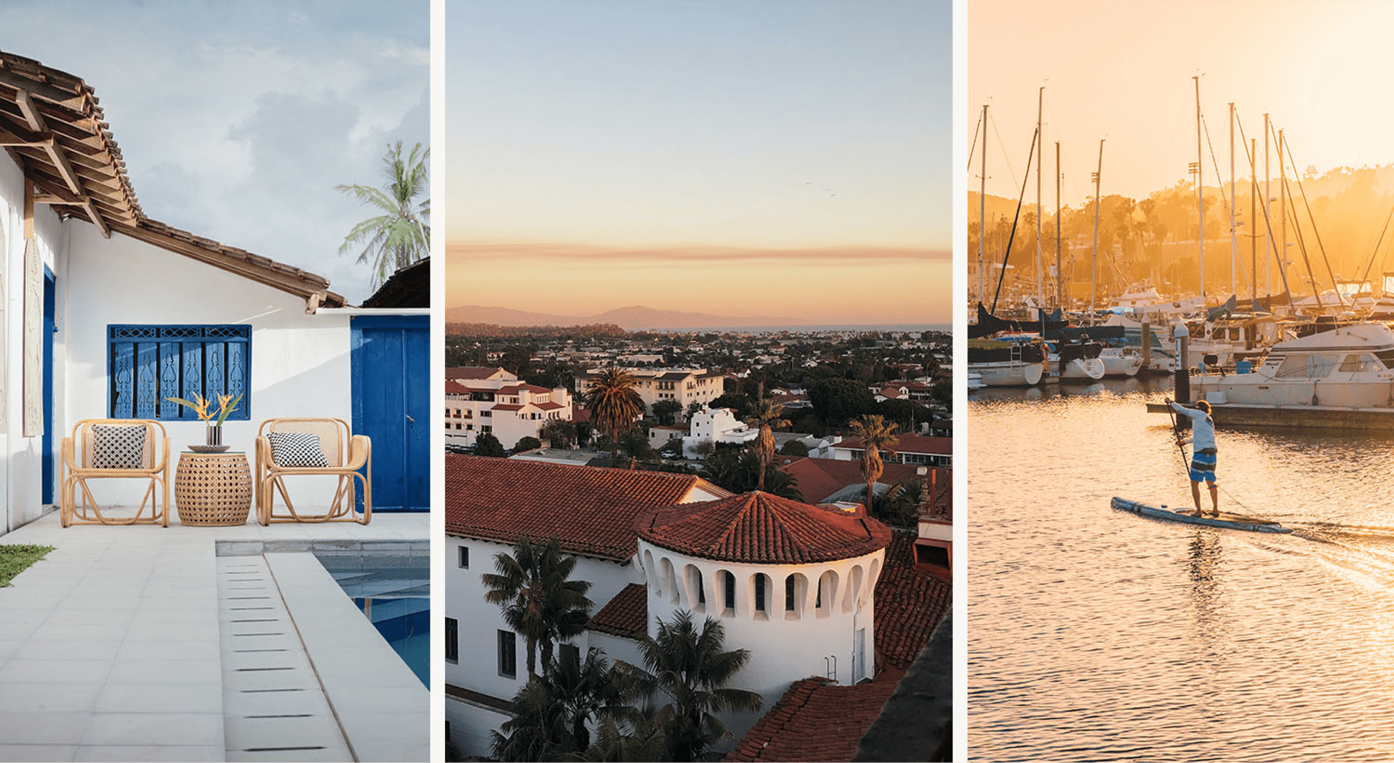
Santa Barbara is one of those places of remarkable, yet effortless beauty and charm. Cities and communities like this don’t just happen by accident. They are places and destinations that take shape around the vision that community members have of “home.” As the largest independent brokerage serving this magical place, we uncovered the significant and special role Village Properties has played in developing, sharing and celebrating Santa Barbara over the years.
We uncovered that Santa Barbara had an undeniable influence on Village Properties, and now it was time for Village Properties to reflect an undeniable connection to Santa Barbara.

The region’s Spanish influence is one of the most notable and striking features found throughout the development and architecture of Santa Barbara. We wanted to find subtle ways to elevate this influence into core moments of the brand identity.

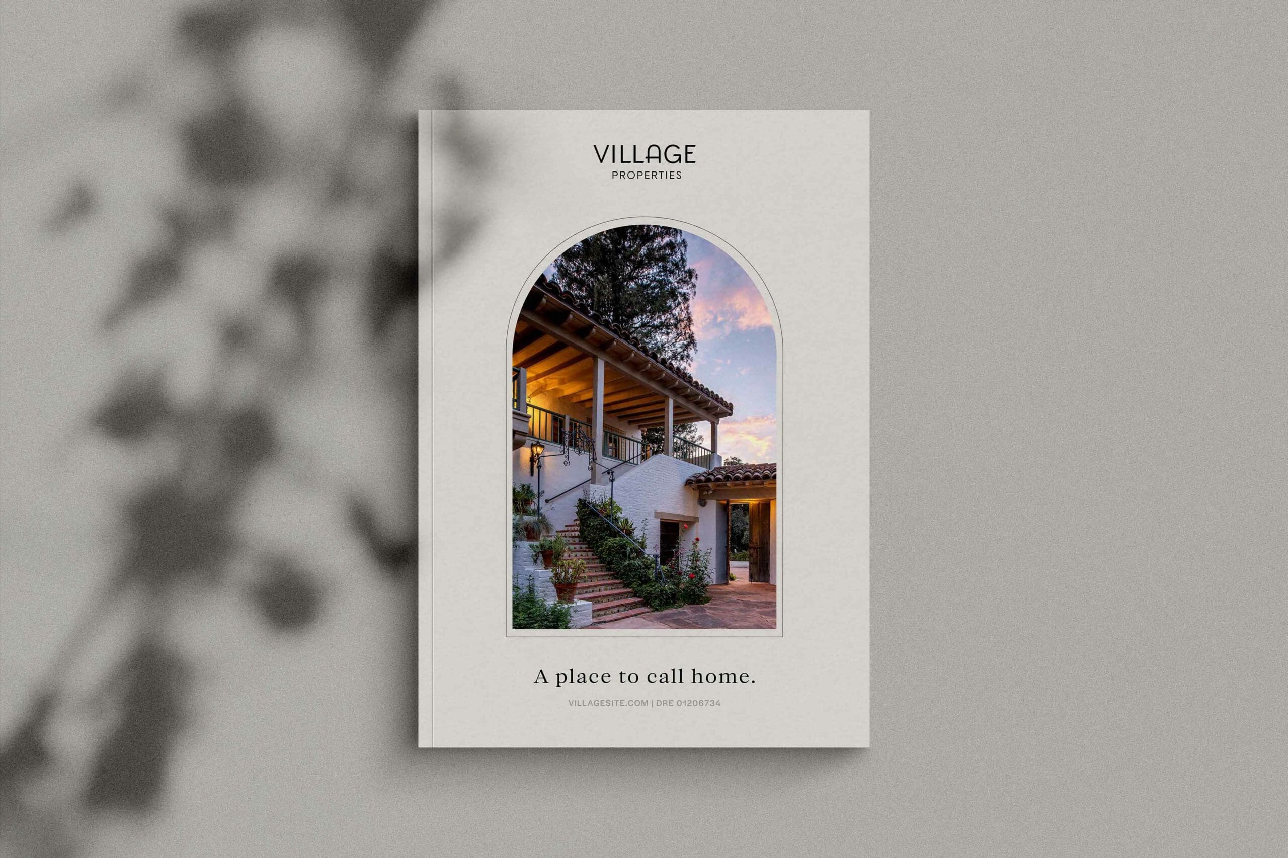
Windows
Framing became an important theme in our design work. Capturing and creating magical vignettes that draw the audience in was an opportuntity designed for Village Properties. We created expressive “windows” inpsired by Spanish architecture and the artwork found within tiles.

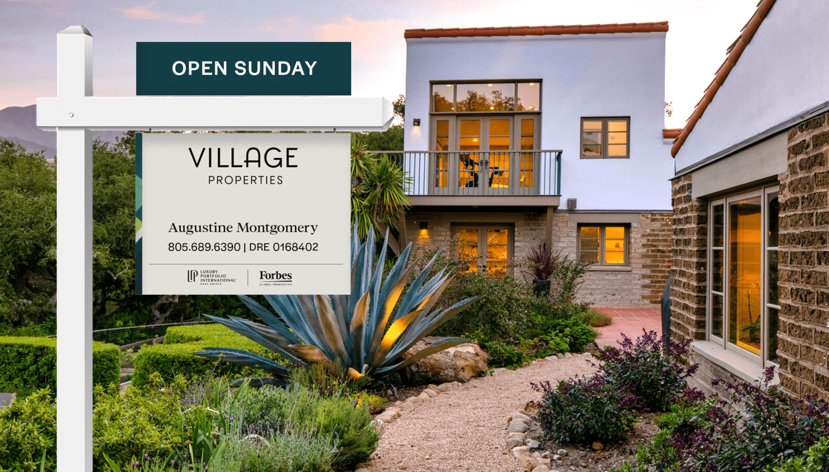
The color story, too, was drawn directly from the region, resulting in a palette that celebrates both the natural and built environments that make this place so special. Neutral tones meet activated hues to create a family of colors that are as equally beautiful as they are evocative.

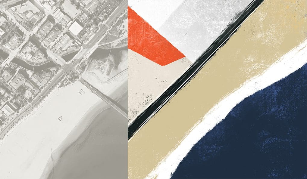
Inspired Paintings
Some of the most striking elements of the Village Properties brand identity were the custom digital paintings we created from actual aerial photography of the region.


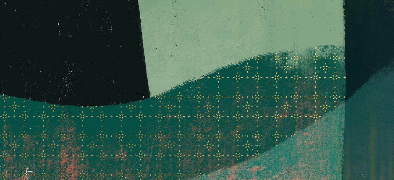
Inspired patterns
One of the most striking features of Santa Barbara is the Spanish influence one sees in the architecture and design elements everywhere. We aspired to capture these notes without being too on-the-nose or derivative. We designed these delicate patterns with the goal of providing visual interest and energy to the identity, while allowing us to dial the volume on this treatment up and down according to the medium and channel.

We derived base symbols or icons from these patterns that we would end up leveraging as embellishments that would activate expressive copy.


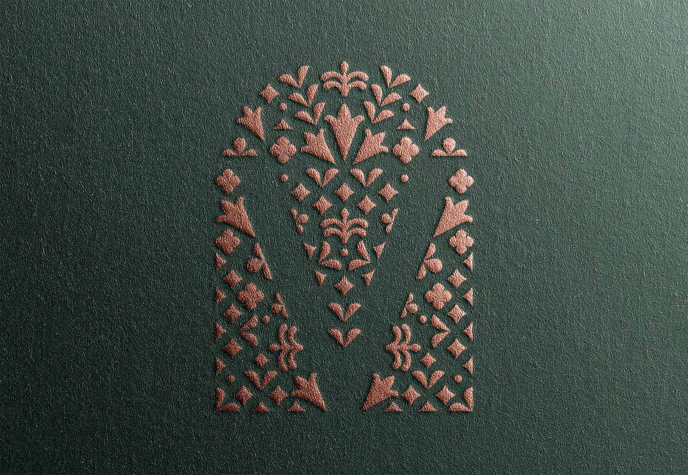
Monogram
One of the more artistic moments of the brand identity is the monogram. Inspired by the region, along with the concept of a garden, the Village Properties monogram brings a whimsical yet elegant moment to both the mundane and the expressive marketing pieces. One color, multicolor and supergraphic alike carry forward an iconic look and feel that is uniquely Santa Barbara.


From the onset of our search for a creative partner, 1000WATT truly stood out as best in class. Their diverse team of principals, strategists, designers, writers, and project managers dug to the core of who we are. The result is a comprehensive brand identity and sophisticated messaging system that truly captures our company and region, and sets us apart from our competition.
Renee Grubb
Village Properties, CEO