
Hasson Company was at a crossroads. With a legendary founder, a strong market position and top producing agents, they could continue doing what had always worked. Or, they could acknowledge an increasingly competitive landscape and fortify their brand for the future. They chose the latter.

A reflection of our place
After we established the brand strategy and story we got to work on a visual system worthy of the compelling company it represented. We anchored the visual approach in the idea that the brand should act as a mirror to the Pacific Northwest, reflecting the beautiful contrasts that exist here. From coastal landscapes and high desert vistas to suburban and urban environments, the brand needed to exist in and reflect a diverse geography.
We redesigned the logo to create a bold visual hierarchy that placed emphasis on the name Hasson; highlighting the legacy of Mike Hasson, the company’s founder, and how his values crafted the brand into what it is today. This hierarchy also makes the logo feel more dynamic and active.
We also crafted a brand glyph inspired by the ‘H’ letterform. This brand glyph acts as a vessel for the Hasson promise and vision, carrying with it the thoughtfulness and intention the company has for its brokers and employees.


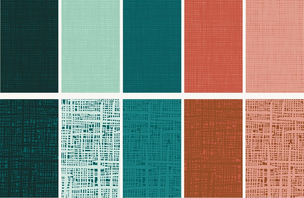
The visual elements we developed for Hasson’s identity were inspired by the hues and textures of the natural environment in the Pacific Northwest. Each color in the palette is pulled from a geological feature or area in the region, culminating in an array of vibrant green tones that are activated by warmer, earthier colors.
The natural, woven textures found in the system add a more handcrafted touch to the brand.


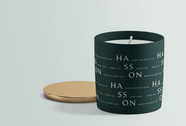
As we began our design process we noticed that the Hasson name had a beautifully balanced symmetry. Bookended by the two, strong vertical lines that make up the “H” and “N,” the openness of the “A” and “O,” and the repetition of the double “S’s” this wordmark had everything we needed to create striking typographic patterns. These expressions, made from both the company name and the tagline further amplify the importance the founder has had on the company and culture.


We helped Hasson announce the rebrand to its agents in a way that would maximize impact and excitement. This included internal messaging and assets like a landing page highlighting the rebrand and story.


“I have never been part of a marketing or branding initiative that has been so well received. I am so confident this will carry us into well into the future. I am bursting with pride and gratitude for what you have created.”
Lynae Forbes
The Hasson Company, President